

9 Living Room Color Combination Ideas to Elevate Your Space
Choosing the right colors for a living room can significantly impact the feel of the space. Selecting the right color combinations enhances comfort and style, making the room more inviting and reflective of personal taste. With so many options available,

it can be overwhelming to decide which schemes work best together.

Color combinations can vary from calming neutrals to bold contrasts, offering something for everyone. Exploring different palettes allows individuals to find the perfect mix that suits their decor and lifestyle. These ideas can help transform a living room into a vibrant and welcoming area for relaxation and socializing.

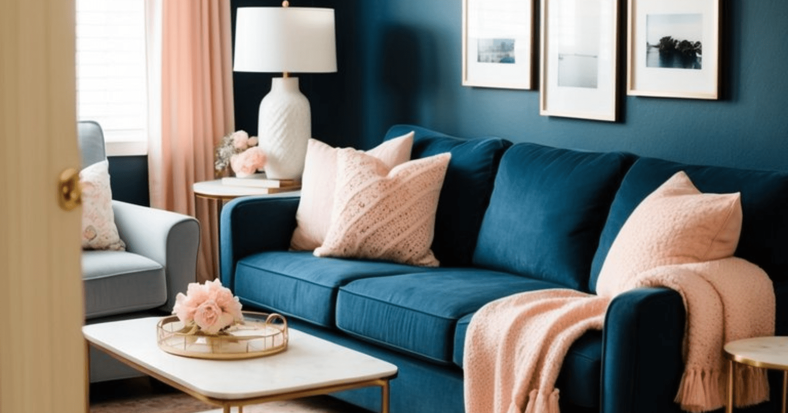
Navy blue and soft pink create a striking and balanced look for living rooms. This color combination offers both calmness and energy, making it appealing for many design styles.
Navy blue serves as a strong base that can anchor the space. It provides depth and sophistication. Soft pink adds warmth and a touch of playfulness, softening the boldness of navy.
Using navy on walls or large furniture pieces allows pink accents to pop. Cushions, rugs, or artwork in shades of pink brighten the room and create a cozy atmosphere. The mix of these colors can be adjusted to suit personal tastes.
Different textures enhance this combination. For instance, a navy velvet sofa pairs well with soft pink cotton pillows. This layering effect adds interest to the living room.
Overall, the harmony between navy blue and soft pink makes them a popular choice. They can transform any space into a stylish and inviting retreat. It is a classic pairing that remains trendy across various design trends.
2) Mustard Yellow and Charcoal Grey

Mustard yellow and charcoal grey create a stylish and modern look for any living room. This color combination offers a nice balance between warmth and coolness. The bright mustard adds a pop of color, while charcoal grey serves as a neutral background.
Incorporating mustard through cushions, rugs, or artwork makes the space feel vibrant. Using charcoal for larger furniture, like sofas or walls, provides a sophisticated touch. This contrast works well in both large and small rooms.
Metallic elements can enhance this look by adding elegance. For example, gold or brass accents in lamps or picture frames blend nicely with these colors.
The versatility of mustard yellow and charcoal grey allows for various styles. Whether the goal is a contemporary or a more cozy ambiance, this combination fits well. It can adapt to different decor preferences, making it a popular choice for modern living spaces.
3) Rich Burgundy and Sage Green

Rich burgundy and sage green create a unique and balanced color combination. The deep, warm tones of burgundy provide depth and elegance to a room. This color works well as a bold accent, adding sophistication without overwhelming the space.
Sage green offers a calming contrast. It brings a soft, natural feel that balances the richness of burgundy. This mix can create a cozy and inviting atmosphere in a living room.
Using these two colors together can enhance various design styles. They work well in both modern and traditional settings. Accessories like cushions, rugs, and curtains can feature one or both colors to unify the look.
It’s important to choose the right shades. Lighter tones of sage can soften the intensity of burgundy. Darker shades of sage can add a dramatic touch while still maintaining harmony with burgundy.
These colors can also complement different materials. Wood, metal, or fabric choices can be adjusted to highlight either burgundy or sage green. This combination offers many possibilities for creating a stylish and welcoming living space.
4) Warm Taupe and Blush

Warm taupe and blush create a soothing and comfortable vibe in living rooms. The gentle tones work well together, making the space feel inviting and friendly.
Taupe serves as a neutral background. It adds warmth without overpowering the room. This allows blush accents to shine through.
Blush can be incorporated through cushions, curtains, or artwork. These soft pops of color complement the taupe rather than clash with it.
This combination is ideal for those looking for an elegant but relaxed atmosphere. It is perfect for both modern and traditional settings.
Using materials like velvet or linen can enhance the cozy feel. This approach adds texture and depth to the design.
Overall, taupe and blush work well in spaces meant for relaxation or gatherings. The colors help create a warm, inviting environment.
5) Emerald Green and Cream

Emerald green and cream create a timeless and elegant combination for living rooms. This color palette can transform any space into a serene retreat.
Using cream walls or furniture allows emerald accents to stand out beautifully. A cream sofa can brighten the room and reflect natural light, making the area feel more spacious.
Adding emerald green through pillows, rugs, or artwork provides a refreshing contrast. A soft green rug on a cream floor ties the room together while adding comfort.
Foliage, such as potted plants, enhances the natural aesthetic. The greenery complements the emerald tones and brings the outdoors inside.
This combination works well in various design styles, from modern to traditional. It adds sophistication without being overpowering.
6) Aqua Blue and Coral

Aqua blue and coral create a vibrant and inviting living room. This color combination is both fresh and energizing, perfect for those looking to brighten their space.
Coral, with its warm tones, serves as an excellent focal point in the room. A coral sofa or armchair can stand out beautifully against aqua blue walls or accents.
Adding aqua blue pillows or rugs can enhance the lively feeling. Together, these colors can create a cheerful atmosphere that feels casual yet stylish.
Designers often recommend using soft white walls to balance the boldness of these colors. This approach keeps the room feeling light and airy.
Using metallic accents like gold or silver can add a touch of elegance. A coffee table or decorative items in these tones can complement the aqua and coral nicely.
Overall, this combination works well in various styles, from coastal themes to modern chic. It appeals to those who want a pop of color in their living area.
7) Burnt Orange and White

Burnt orange and white create a refreshing and vibrant living room look. The warmth of burnt orange pairs well with the coolness of white, bringing balance to the space.
Using burnt orange as an accent color adds energy without overwhelming the room. White can be used for walls, furniture, or decorative accessories, providing a clean backdrop.
A burnt orange sofa or chairs can become focal points against white walls. To enhance the design, adding textured white throws or pillows can introduce comfort and style.
This color scheme works in various design styles. It is suitable for modern, coastal, or even traditional themes, making it versatile.
For a cozy atmosphere, consider adding wooden elements in light or dark shades. This addition can complement both burnt orange and white beautifully.
In summary, the combination of burnt orange and white can create a warm and inviting living area. The result is a balanced space that feels both lively and comfortable.
8) Olive Green and Rust

Olive green and rust create a warm and inviting atmosphere in any living room. This color combination balances earthy tones, making it visually pleasing.
Using olive green on walls or furniture sets a calming backdrop. It pairs well with the warmth of rust, often seen in sofas or decorative accents.
Incorporating natural wood elements enhances the rustic feel. Accessories like pillows and throws in rust add pops of color, bringing life to the space.
Large windows allow natural light to flow in, highlighting the beauty of these colors. Indoor plants can also complement the look, introducing more earthy tones.
This combination works well for those seeking a modern yet cozy environment. It merges contemporary style with a touch of rustic charm, ideal for various design preferences.
9) Lavender and Silver

Lavender and silver create a calming and elegant atmosphere in a living room. This combination adds sophistication without overwhelming the space.
Using lavender as the main wall color provides a soothing backdrop. It can promote relaxation, making the living room a comfortable spot to unwind.
Silver accents enhance the elegance of the lavender. Items like silver coffee tables, lamps, and decorative vases add a touch of shimmer.
A few carefully selected silver accessories can make a big difference. They complement lavender beautifully and create a balanced look.
Choosing white furniture alongside lavender and silver makes the room feel more open. The light colors work together to maintain a serene environment while adding a modern twist.
This color combination is versatile and can fit various styles, from contemporary to classic. Whether for daily living or special occasions, lavender and silver serve as a chic choice for any home.
The Psychology of Color in Living Rooms
Colors can greatly influence emotions and perceptions in a living room. Understanding how different hues affect mood and space can help create an inviting and comfortable atmosphere. Two key aspects to consider are the emotional impact of colors and how color temperature affects the perception of space.
Emotional Impact of Colors
Each color can evoke specific feelings. For instance, warm colors like red and yellow can energize the space, prompting feelings of excitement and happiness. These shades encourage social interaction, making them ideal for gathering areas.
In contrast, cool colors such as blue and green often promote relaxation and calmness. These tones are soothing and can create a tranquil environment, perfect for unwinding after a long day.
Here’s a brief look at common colors and their emotional impacts:
| Color | Emotion |
|---|---|
| Red | Excitement |
| Yellow | Happiness |
| Blue | Calmness |
| Green | Balance |
| Purple | Creativity |
Selecting colors based on their emotional impact can guide personal choices in living room design.
Color Temperature and Space Perception
Color temperature affects how one perceives space in a living room. Warm tones tend to make a room feel cozier and more inviting. These colors can draw people together, enhancing the sense of closeness.
Cool tones, on the other hand, can make a room feel larger and more open. They help to expand the perception of space, which can be beneficial for smaller living areas.
Consider the following examples:
- Warm Colors: Creams, soft reds, warm yellows
- Cool Colors: Light blues, muted greens, soft grays
By thoughtfully combining colors, the living room can transform into a space that feels both welcoming and expansive, tailored to individual preferences and needs.
 Assessing Your Space and Lighting
The first step in selecting colors is to analyze the living room’s size and lighting. Natural light can influence how colors appear throughout the day. A room with ample sunlight can handle bolder colors. In contrast, smaller or dimly lit areas often benefit from lighter shades to create an illusion of space.
Consider the following:
- Size of the Room: Light colors can make a small room feel larger.
- Type of Lighting: Warm lights can enhance neutral tones, while cool lights may bring out blues and greens.
- Existing Features: Take into account features like flooring and furniture. They can significantly impact color choices.
By carefully assessing these elements, a suitable color palette that enhances the living room’s overall feel can be developed.
Complementary Colors vs. Contrasts
After assessing the space, it’s important to choose color schemes that balance contrasts and complements. Complementary colors are opposite on the color wheel. They tend to create vibrant, lively spaces, making them great for accent pieces.
Examples include:
- Blue and orange
- Purple and yellow
Contrasting shades can liven up a room while still keeping harmony.
On the other hand, sticking to similar tones can create a calm atmosphere. Shades of blue and green or variations of neutrals can be soothing.
The choice between bold contrasts and softer tones depends on desired mood and function. Mixing both approaches can also create interest while maintaining balance.
Common Mistakes to Avoid
Choosing colors for a living room can be tricky. Some common mistakes can lead to an uncomfortable or uninviting space. Understanding these pitfalls can help create a better atmosphere.
Overwhelming the Space with Bold Colors
Using too many bold colors can make a room feel chaotic. While vibrant hues can create energy, balance is essential.
When selecting colors, consider the following tips:
- Limit Bold Colors: Choose one or two bold colors as accents.
- Use Neutrals: Combine bold shades with neutral tones to ground the space.
For example, a bright orange couch can pair well with soft beige walls. This creates an inviting atmosphere without overwhelming the senses.
Room size matters too. In smaller rooms, excessive bold colors can feel claustrophobic. Opt for lighter shades to open up the space while still including pops of color.
Ignoring the Room’s Function
Not considering how a room is used can lead to poor color choices. Colors affect mood and functionality.
In a living room, people often gather for relaxation or entertainment.
Here are things to consider:
- Choose Calming Colors: Soft blues or greens promote relaxation.
- Consider Lighting: Natural and artificial light can alter color perception.
For instance, a room with lots of sunlight can handle darker shades without feeling gloomy.
It’s key to remember that the chosen colors should reflect the atmosphere desired in the room. Aligning color choices with the room’s purpose enhances overall comfort and enjoyment.

Willie Drew
I’m Willie Drew, and I’m here to help you turn your home into a space you’re proud to show off using simple projects, smart tools, and realistic budgets.