


7 Agreeable Gray Sherwin Williams Ideas for Modern and Timeless Interiors
I love how easy it is to style with Agreeable Gray Sherwin Williams ideas. In my home, this soft greige plays nice with white trim, natural wood, and even bold navy accents.
I use it in small spaces and open rooms because it stays calm and welcoming throughout the day.
If you want modern yet cozy, this color makes it simple to get there.
1) Agreeable Gray Living Room Base
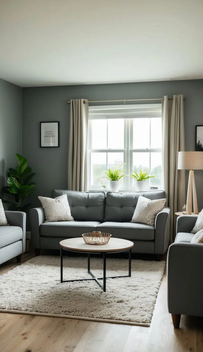
Agreeable Gray works well as a warm neutral base in living rooms. Its color leans toward beige and brown tones, creating a soft, inviting atmosphere.
This paint color suits many styles because it is neither too cool nor too warm. It pairs easily with different furniture and decor choices.
Using Agreeable Gray allows for flexibility. People can add colorful accents or keep the room calm with other neutral shades.
It also reflects light nicely, keeping living spaces bright. This helps rooms feel open without looking cold or stark.
Choosing Agreeable Gray offers a balanced background. It supports both modern and traditional designs with ease.
2) Agreeable Gray With White Trim
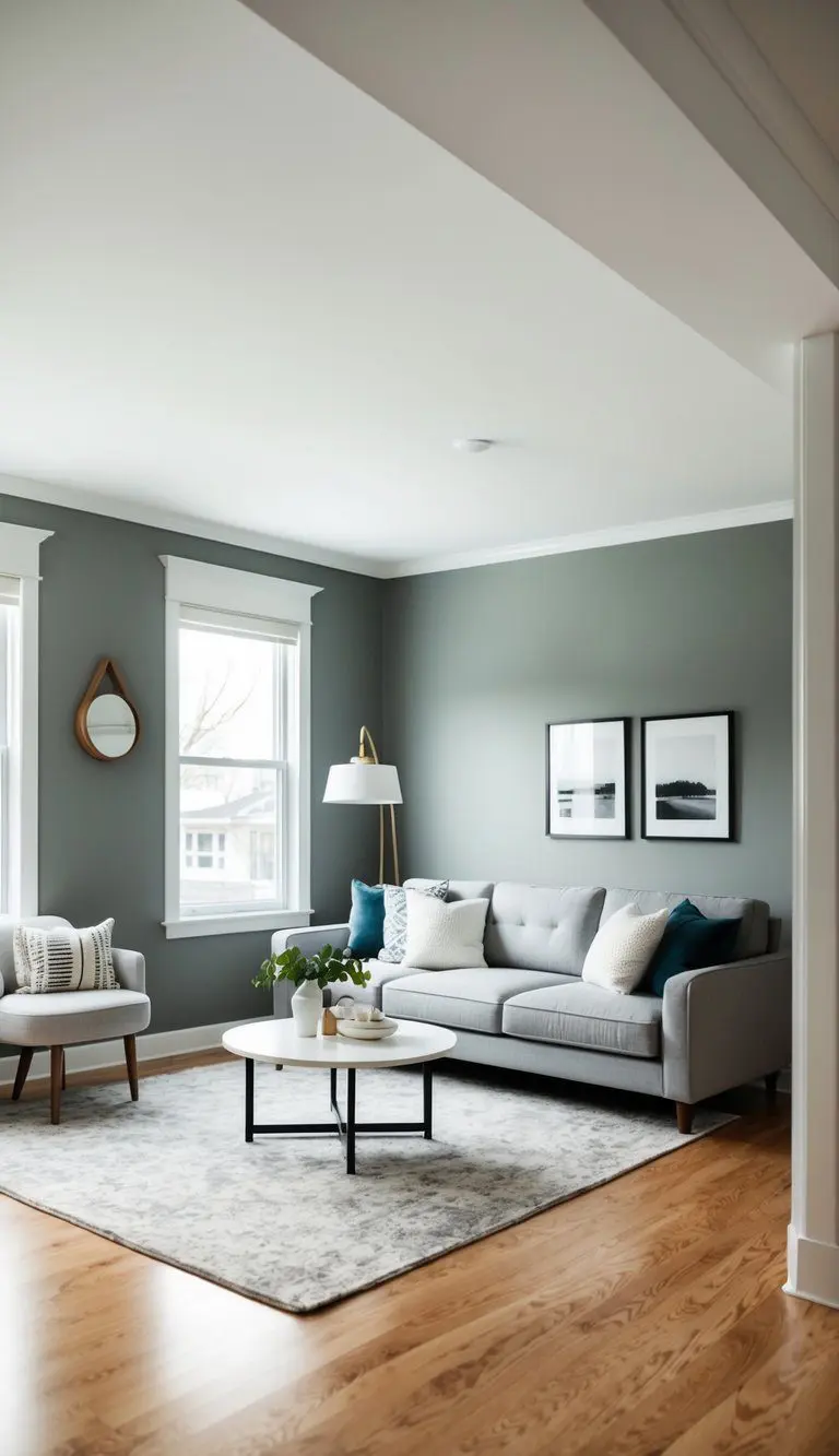
Agreeable Gray works well with white trim because it highlights the soft warmth of the gray. White trim adds a fresh, clear edge that gives rooms a neat and polished look. This pairing helps define the space without being too bold.
Choosing a bright white, like Pure White (SW 7005), creates a sharp contrast. The white makes walls stand out while keeping the room feeling open and airy. This balance works in both modern and traditional home styles.
Using white trim also makes architectural details, like window frames and baseboards, more visible. This contrast draws attention to these features and helps the space feel more finished. It allows the gray to remain the main color while the white adds subtle interest.
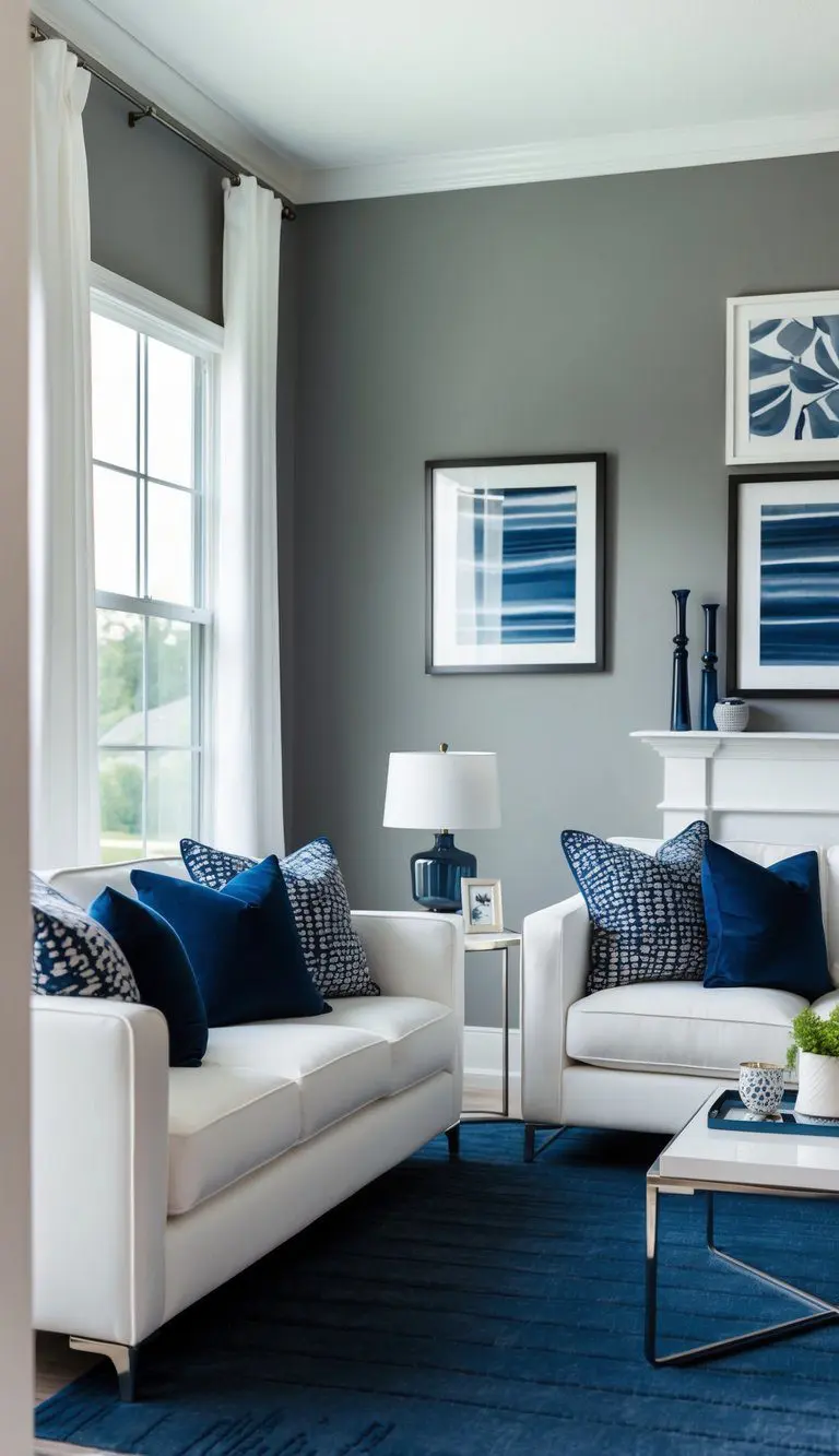
Agreeable Gray is a soft, warm neutral that works well with stronger colors like navy blue. Using navy blue as an accent adds depth and contrast without overwhelming the space.
Navy blue accents can appear in furniture, throw pillows, or curtains. These touches create a refined and classic feel when paired with the light, calming tone of Agreeable Gray.
This color combination suits various rooms, especially living rooms and bedrooms. It balances warmth and coolness, offering a modern yet timeless style.
Together, Agreeable Gray and navy blue produce a calm but elegant atmosphere. This pairing can fit both traditional and contemporary designs, making it a versatile choice for many homes.
4) Natural Wood Warms Agreeable Gray
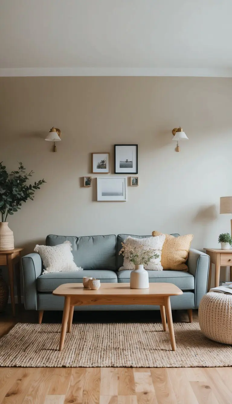
Natural wood furniture works well with Agreeable Gray because the paint has soft beige undertones. These warm tones complement the calm, neutral look of the wood. Using wood pieces helps bring a cozy and inviting feel to the space.
Light, medium, or dark wood all pairs nicely with Agreeable Gray. Light woods create a fresh and airy look. Dark woods add contrast and richness without clashing with the paint color.
Choosing natural finishes without too much gloss keeps the room balanced. The wood’s texture stands out against the smooth, muted gray of the walls. This mix highlights the paint’s subtle warmth.
Overall, natural wood furniture is an effective way to bring out the beige qualities of Agreeable Gray. It adds depth and warmth while keeping the room neutral and versatile. This combination works well in living rooms, bedrooms, and kitchens.
5) Pastel Accents With Agreeable Gray
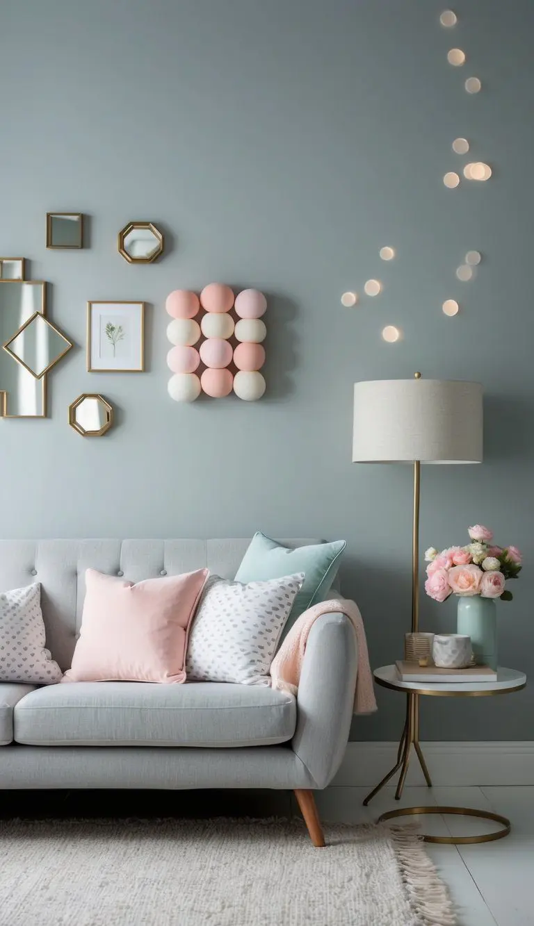
Agreeable Gray by Sherwin Williams is a neutral color that works well with many shades. When paired with soft pastel accessories, it creates a calm and soothing space.
Light pinks, blues, and greens add a gentle touch without overpowering the gray. These pastel tones help keep the room feeling fresh and peaceful.
Adding pastel pillows, curtains, or artwork can soften the overall look. It balances the warm gray undertones in Agreeable Gray.
This combination suits living rooms, bedrooms, or any space meant for relaxation. Using soft pastels with Agreeable Gray can make the ambiance inviting and gentle.
The mix of neutral and pastel colors creates a subtle contrast. This contrast enhances the room’s style while keeping it easy on the eyes.
6) Agreeable Gray Kitchen Cabinets
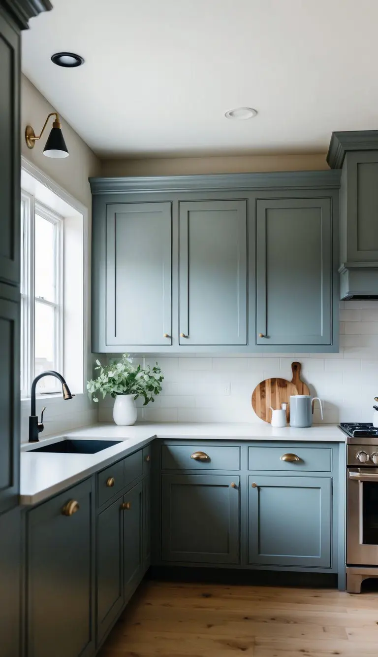
Agreeable Gray is a soft, neutral gray that works well on kitchen cabinets. It can update a traditional kitchen without replacing the classic style. The color adds a fresh and clean look while keeping the room warm and inviting.
Using Agreeable Gray on cabinets helps balance other elements like white walls or darker countertops. This color blends easily with various materials and finishes, making the space feel more modern.
It also works with different design styles. Whether the kitchen has farmhouse touches or more classic details, Agreeable Gray can bring a subtle, stylish change that feels current.
This paint choice brightens the room without being too bold. It can highlight the cabinet’s design and make the kitchen feel more open and airy.
Overall, applying Agreeable Gray cabinets is a simple way to refresh a traditional kitchen while keeping it timeless and practical.
7) Cozy Bedroom With Agreeable Gray
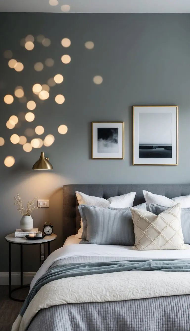
Agreeable Gray works well on bedroom walls because it offers a soft, neutral color. This gray has warm undertones, which can make a room feel more comfortable and welcoming.
It blends nicely with many other colors, so it suits different styles of furniture and decor. Whether the room is modern or traditional, Agreeable Gray helps to balance the space.
The color is also versatile enough to adjust with lighting changes. In natural light, it looks bright and fresh, while in dim light, it feels warmer and more relaxing.
Using Agreeable Gray on bedroom walls creates a calm setting. This makes it easier for people to unwind and rest. Its neutrality avoids overwhelming the senses, supporting a peaceful atmosphere.
FAQ’s About My Agreeable Gray Sherwin Williams Ideas
What Colors Pair Best With Agreeable Gray In A Modern Farmhouse Look?
White trim and natural wood are my go tos white keeps edges crisp while wood warms the space. Add navy blue accents for contrast that still feels relaxed and timeless.
Will Agreeable Gray Work In Small Spaces Without Feeling Dark?
Yes. Its balanced greige tone reflects light well, especially with white trim and lighter wood furniture. A few soft navy accents add depth without shrinking the room.
Understanding Agreeable Gray By Sherwin Williams
Agreeable Gray is known for its balanced nature, blending gray with beige tones. Its appearance changes depending on lighting, room size, and surrounding colors, making it versatile for many spaces.
Color Profile And Undertones
Agreeable Gray (SW 7029) is a greige, which means it combines gray and beige. It leans more toward warm gray because of its subtle beige undertones. This warmth prevents it from feeling too cold or sterile, unlike pure grays.
The undertones help the color blend well with both warm and cool color schemes. It’s neither too dark nor too light, offering a soft, neutral background. This subtle shift allows it to work well in areas where a calm, inviting atmosphere is desired.
Ideal Lighting Conditions
Lighting greatly affects how Agreeable Gray looks on walls. In rooms with plenty of natural light, the color appears lighter and warmer. It can have a slightly creamy feel in bright sunlight.
In low or artificial light, it may look cooler or more gray. South-facing rooms tend to bring out its warmth the best, while north-facing rooms might show more of the gray undertones. It’s important to test paint samples at different times of day before committing.
Tips For Pairing Furniture And Decor
Agreeable Gray is a versatile color that works well with many styles and accent colors. To make the most of this paint, it’s important to choose the right furniture and decor that balance warmth and coolness.
Choosing Complementary Accent Colors
Agreeable Gray blends gray and beige, which makes it easy to pair with both warm and cool tones. For a warm look, colors like soft creams, muted yellows, and rich browns work well. These tones bring out the beige side of the paint.
For a cooler effect, blues and greens can highlight the gray undertone. Navy blue or sage green are good choices for accent walls or smaller decor pieces like throw pillows and rugs.
Neutral accents such as white, black, or charcoal give a clean, modern feel. Using color sparingly in lighting fixtures or artwork can keep the space balanced without overwhelming the walls.
Decor Styles That Elevate Agreeable Gray
Agreeable Gray fits well with multiple decor styles. It enhances modern farmhouse interiors by pairing with natural wood furniture and rustic metal accents. These elements add warmth while keeping the look simple.
In contemporary spaces, sleek furniture with metal or glass details complements the paint’s subtle tone. Minimalist decor with straight lines can enhance the gentle gray-beige without clashing.
For traditional rooms, classic furniture in dark wood and soft fabrics like linen or velvet works nicely. This style uses Agreeable Gray as a neutral background that allows rich colors and textures to stand out.

Willie Drew
I’m Willie Drew, and I’m here to help you turn your home into a space you’re proud to show off using simple projects, smart tools, and realistic budgets.